How Typography Enhances Readability and Visual Appeal in Posters
Typography is one of the most crucial elements of poster design. Whether you’re creating a poster for a business, event, or artistic project, the way you use typography can make or break its effectiveness. From creating a strong first impression to ensuring your message is understood, typography plays a pivotal role in both readability and visual appeal. In this article, we’ll explore how the right typography choices can elevate your poster designs, making them more engaging and visually appealing.
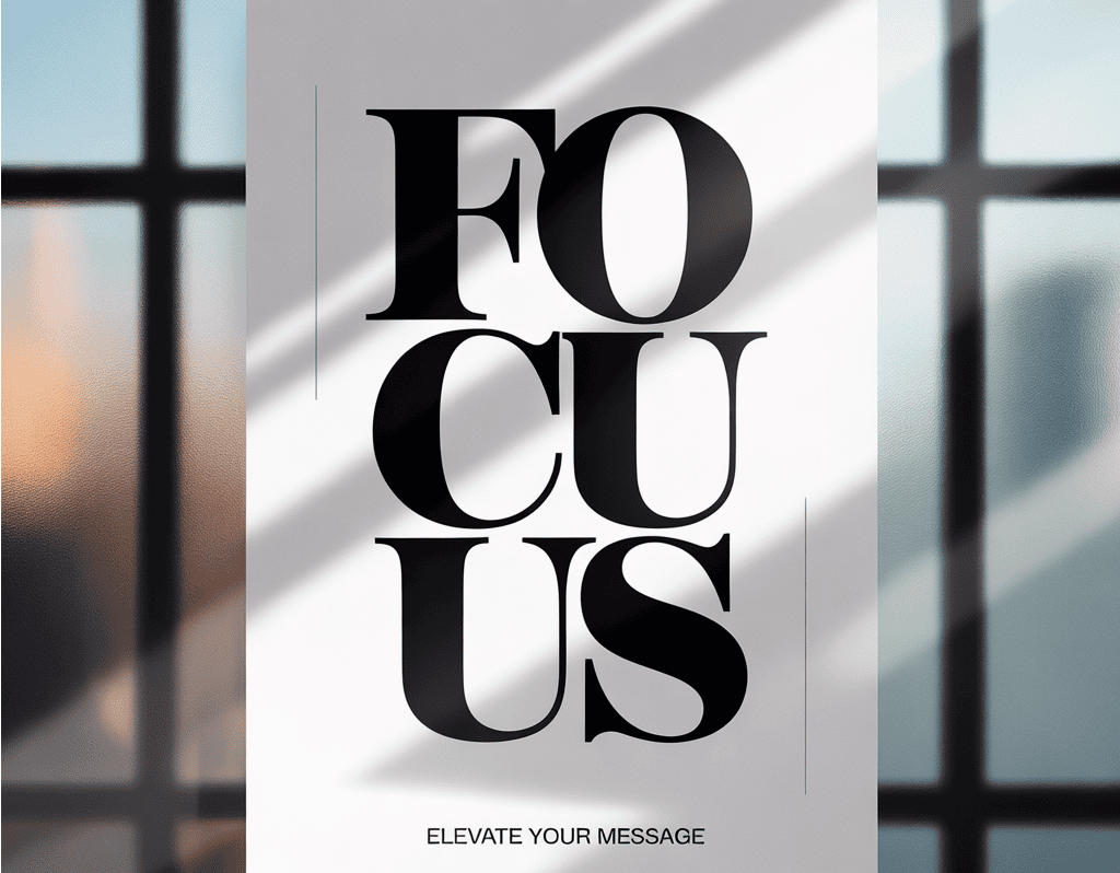
The Power of Typography in Poster Design
In the world of design, typography is the art of arranging type in a way that is visually compelling while also ensuring that your message is clearly communicated. The right fonts, sizes, and spacing can transform a bland design into something eye-catching and professional. Typography is not just about aesthetics; it’s about functionality too. Good typography ensures that your audience can read and understand your message effortlessly.
If you're looking for a simple, intuitive way to create posters with top-notch typography, check out Adobe Express printable poster tool. This tool offers a range of customizable templates, giving you control over your design’s typography.
Enhancing Readability with the Right Fonts
The most basic principle in typography is readability. No matter how beautiful your poster looks, if it’s difficult to read, your audience won’t be able to grasp your message. So, choosing the right font is essential.
Serif vs. Sans-Serif
There are two main categories of fonts: serif and sans-serif. Serif fonts, with their decorative edges, are often associated with tradition and formality. They’re great for posters that aim to communicate reliability and seriousness, like academic or business posters. On the other hand, sans-serif fonts are clean, modern, and easier to read at a distance. They’re ideal for event posters or anything that needs a contemporary, fresh look.
When choosing a font, consider your target audience and the purpose of your poster. Sans-serif fonts tend to be the go-to choice for posters that need quick readability. For example, Helvetica or Arial are popular sans-serif fonts, known for their simplicity and legibility. Serif fonts like Times New Roman or Georgia can work well for more formal, sophisticated designs.
Font Size and Hierarchy
Font size plays a significant role in establishing a visual hierarchy in your design. The title of your poster should be the most prominent text element. It should stand out immediately and grab attention. Use a large font size for the headline and slightly smaller sizes for the body text and other details. This ensures that the viewer’s eye is naturally drawn to the most important information first, then follows the rest of the content in an organized flow.
A helpful guideline is to make the title at least 60pt for larger posters and 40pt for smaller designs. Subheadings can be around 30pt and body text can range from 12pt to 18pt, depending on the space and the importance of the information.
Creating Visual Appeal: Font Pairing and Contrast
The visual appeal of a poster is not just about picking one font—it’s about pairing fonts in a way that enhances the overall design. Font pairing can create interest and help distinguish between different elements of your poster, like titles, subheadings, and body text.
How to Pair Fonts Effectively
An effective font pairing often involves combining a serif font with a sans-serif font. This combination brings balance to your design and creates a pleasing contrast. For example, pair a bold serif font for the title with a clean sans-serif font for the body text. This pairing works well because it creates a hierarchy that’s easy for the viewer to follow.
Another tip is to mix bold fonts with regular fonts. For instance, using a bold font for the headline helps draw attention, while a regular-weight font for the body text keeps the design legible and balanced.
Contrast for Emphasis
Contrast is key to making certain elements of your poster stand out. If you use a light-colored background, opt for dark-colored text for maximum readability. Conversely, on a dark background, use light-colored text to ensure it’s easy to read.
Contrast can also be achieved through font weight. Using bold fonts for the most important information (like dates or calls to action) can make those elements pop. Make sure to strike a balance, though, as too much bold text can make your design feel cluttered.
Spacing and Alignment: Creating a Balanced Layout
Proper spacing and alignment are just as important as font choice when it comes to readability and overall visual appeal. These elements help create a clean, organized design that’s easy on the eyes.
Line Spacing (Leading)
Line spacing, also known as leading, refers to the vertical space between lines of text. If the lines are too close together, the text will look cramped and difficult to read. If the spacing is too wide, the text will feel disjointed and disconnected. The ideal line spacing is typically 1.2 to 1.5 times the font size. This ensures that the text feels open but still cohesive.
Letter Spacing (Tracking)
Letter spacing, or tracking, is the space between all characters in a line of text. Tight letter spacing can make your text feel dense and difficult to read, while too much spacing can make the design feel disjointed. Adjusting the tracking can help create a more polished, balanced look. For large headlines, increasing the tracking slightly can make the text feel airy and more impactful.
Alignment for Clean Layouts
Text alignment is another element that impacts the structure of your poster. Most posters benefit from left-aligned text, as it’s the easiest to read. Center-aligned text can work well for short headings or quotes but can be harder to read in long paragraphs.
Right-aligned text or justified text can be used creatively but should be used sparingly to avoid creating awkward gaps between words or letters.
Conclusion: Typography as a Design Tool
Typography isn’t just about making your text readable; it’s about making it engaging and effective. By carefully selecting fonts, pairing them thoughtfully, and ensuring proper spacing and alignment, you can elevate your poster designs and communicate your message clearly.
For a quick and easy way to bring your poster designs to life with the right typography, try out Adobe Express printable poster tool. This tool provides intuitive templates and design options that can help you create professional posters that capture attention and communicate your message effectively.
Typography is a powerful tool in design, and when used correctly, it can transform your poster into a visually appealing and highly effective communication tool.
